The Carrier Comparison
Compare 5 Carriers side by side for a particular class or sic code. Drill down by state.

Written by rob g
Updated at March 29th, 2023
In this category:
Table of Contents
The Carrier Comparison lets you compare up to 5 carriers side by side. Drill down by class or SIC, and state.
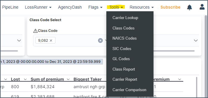
Access from the Tools drop down - https://www.insurancexdate.com/carrier-comparison.php
Notes on Filtering:
Use class or sic code, but not both at the same time. Doing so just eliminates the states without a class code.
20 states have class code data, 28 have SIC code, 24 have LCM filings and 7 have premium (8 including NJ, which has it for Assigned Risk).
Data availability by State: https://kb.insurancexdate.com/en_US/commercial-reports/commercial-data-availability
Class code will provide data exactly specific to the class you're interested in (and class is what is used to price), SIC will typically provide a broader result (because all states have SIC code data).
You must include commas (,) in the class or sic code (i.e. 9,082).
It is easier to input a code first, and remove the existing code. If you remove the existing code first, you'll need to wait for the results to update before you can enter the new code.
Average LCM & Percentage Change
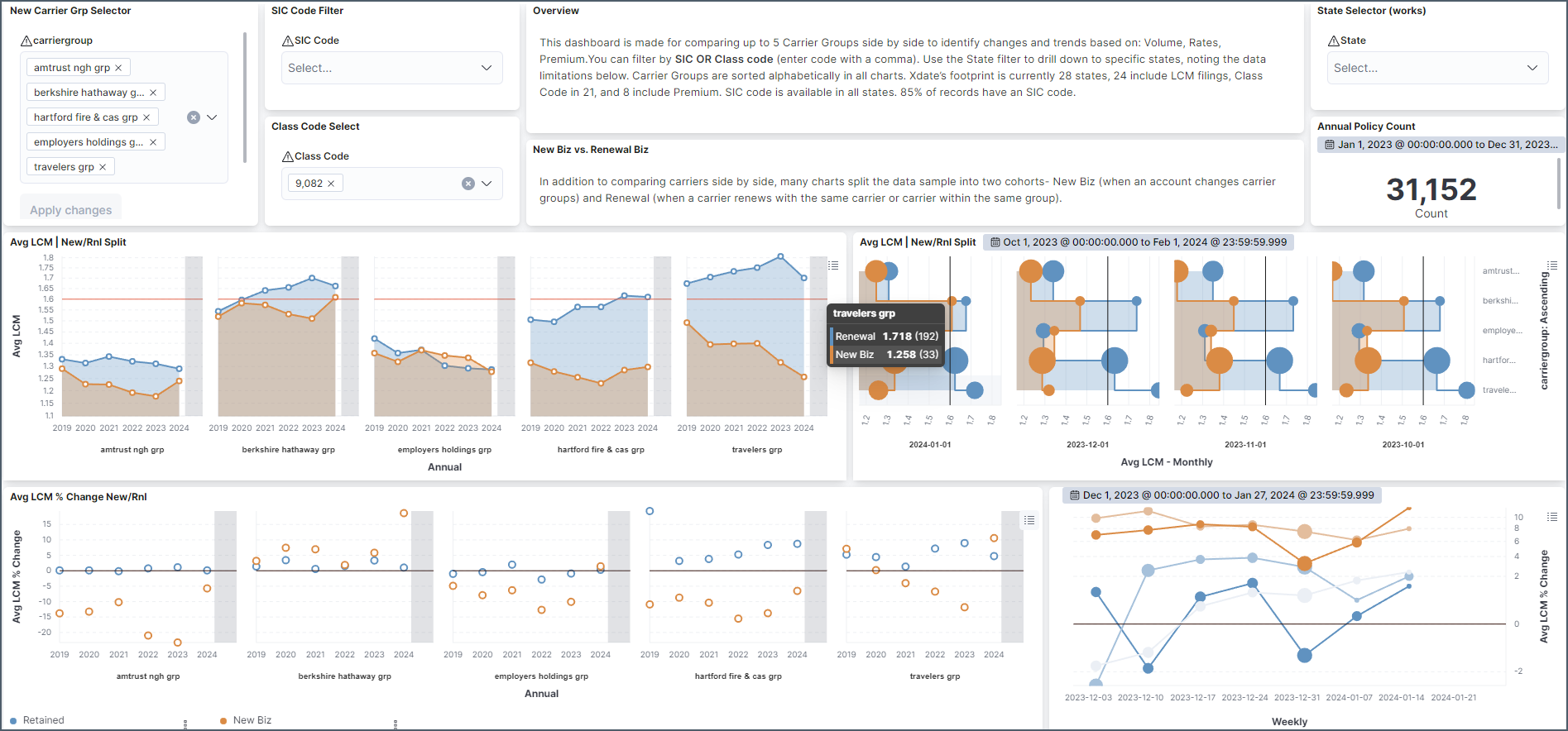
Most of these charts split businesses into 2 cohorts - new biz and renewals. The first set of charts plot the carriers' average LCM filing used for an annual and monthly trend. The monthly trend also indicates how many businesses were at play in the tool tip (also represented by ball size).
Below is the percentage change trend for an annual and weekly trend. This is the average change felt by the business at renewal. As you can see many businesses see a decrease when they switch, regardless of who they switch to.
Premium Change
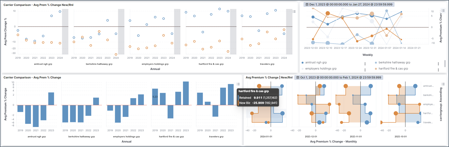
These charts (mostly) mirror the LCM charts. The premium change (%) that the insured sees at renewal is averaged out for an annual, weekly, and monthly trend. The blue bar chart is the annual composite, the weighted average of the chart above it.
Volume
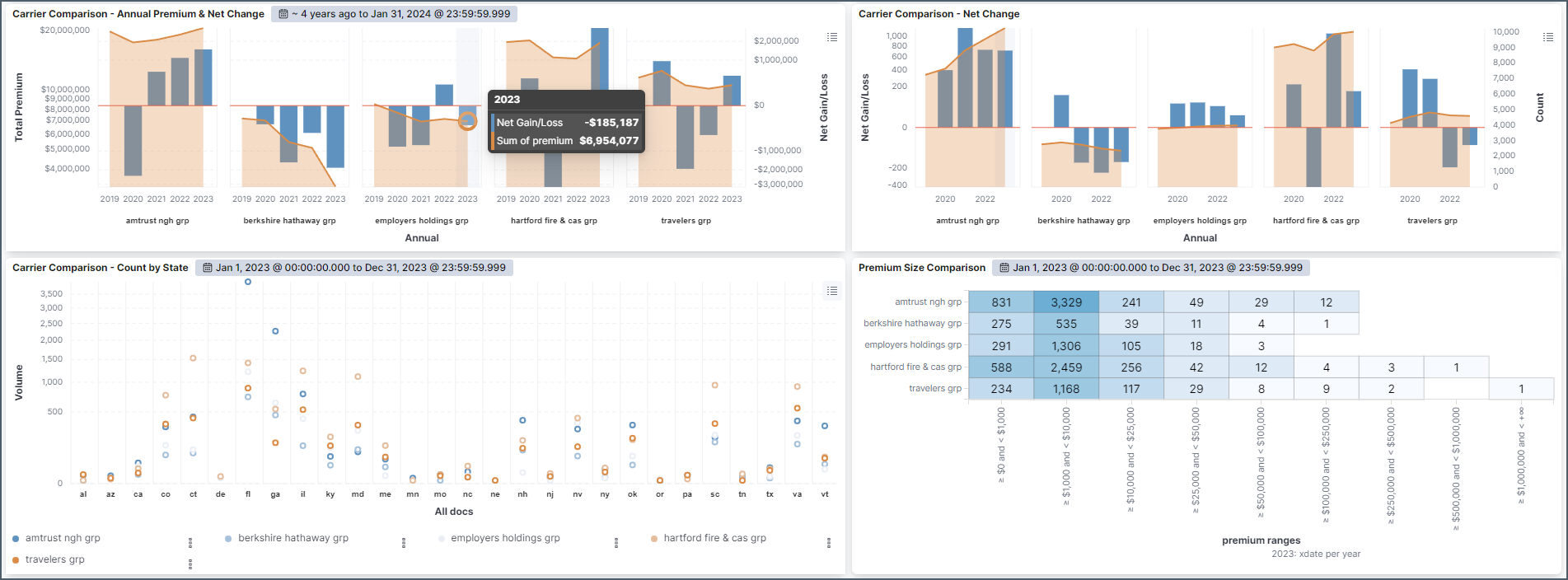
The last set of charts deal with volume. Annual premium and policy volume are at the top. State and Premium Bracket breakdowns at the bottom.