Carrier Report

Written by rob g
Updated at June 5th, 2023
In this category:
Table of Contents
Overview
The Carrier Report focuses on the incumbent at the state level. At a minimum you will be able to view historical renewal volume broken down by industry, Underwriting tier utilization, and a rolling 6 month win/loss record vs. peers.
Won & Lost Record, Industry breakdown
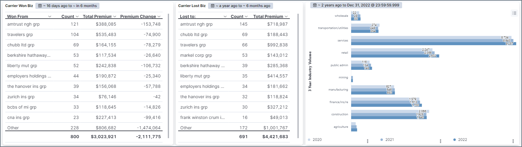
Win/Loss Record
These two text charts provide you with the incumbents track record for the preceding year. A count of wins, and losses, broken down by Carrier Grp. A favorable indication would be your market high on the Lost chart and low on the Win.
Underwriting Company Breakdown & Monthly Trends
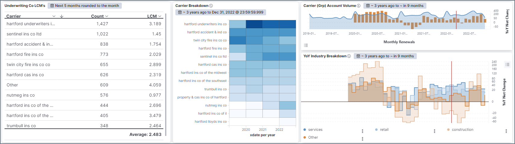
Underwriting Co LCM's
This text chart breaks down each carrier's current LCM filing for reference
Carrier Breakdown
For Groups, this heat map illustrates underwriting company utilization. If LCM's are available in your state this can be very telling of how aggressive or prudent a market's underwriting practices are over time.
Account Volume
The area chart (shaded) is monthly renewal volume. The orange bars are the net change in written accounts for a given month relative to last year.
YoY Industry Breakdown
This bar chart is the same as above, except it is broken down by industry and provides a TON of context in regard to the incumbent's appetite and where it is trending. Since it is split by industry you can see when a carrier might be getting 'cold' on an industry while getting 'hot' on another. Note that the most current month or two may be partial.
LCM Trends
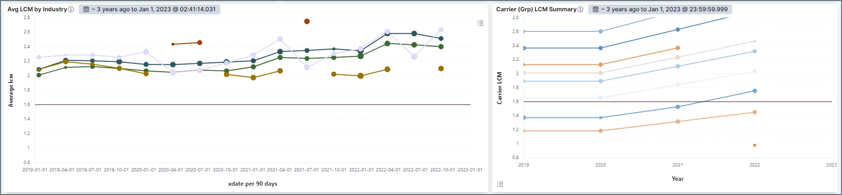
LCM Industry
This chart trends the carriers' average LCM for the top 3 industries (the remaining grouped as other). The LCM axis on this chart is fixed between 0.8 and 2.8 so users have a visual cue as to the market's competitiveness from a rate perspective.
LCM Summary
This chart plots each underwriting co's LCM filing on an annual basis.
WC Premium
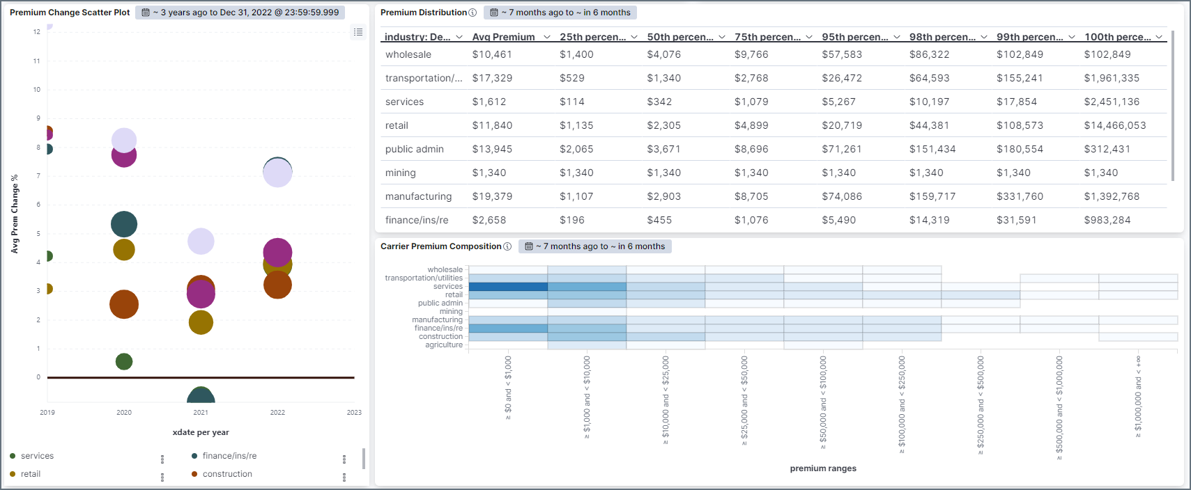
Premium Change
This is a scatter plot of the average premium increase/decrease % split by industry over time. Size of dot indicates volume of accounts. Hover over the dots to view tool tips.
Premium Distribution
This parses account-level premium for the market and is split into percentile ranks, along with the average premium for comparison. This will give you a feel for the size spectrum of the market at the industry level. It is skewed toward the higher percentiles because, as you will see, the majority of WC is comprised of small accounts.
Where the average premium falls along its corresponding percentiles may indicate preference to size (large or small).
Premium Composition
This is a heat map of accounts written by premium bracket.
Experience Mods
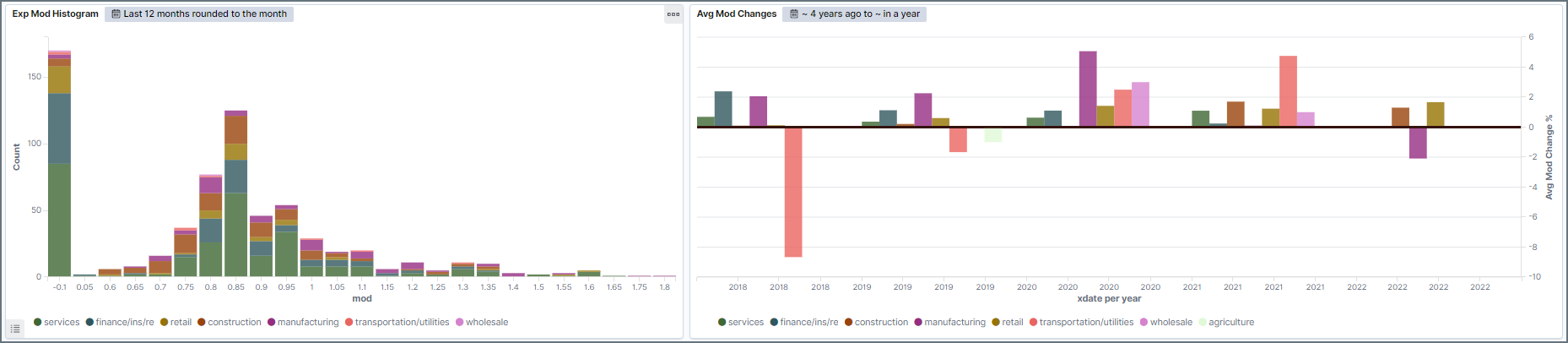
Mod Histogram
The mod histogram is broken down by industry and looks at the last 12 months. Merit and/or non-qualified accounts end up on the far left.
Average Mod Change
Average Mod change % of a market's book broken down by industry. Are they going after risky stuff, safe, find out here.